Essential Tips for Creating Effective Corrugated Signs
In the competitive world of advertising, creating impactful Corrugated Signs is essential. John Smith, a leading expert in the signage industry, emphasizes that "a well-designed sign can capture attention in seconds." This sharp insight highlights the importance of effective design in conveying messages.
When designing a Corrugated Sign, one must consider various factors. Color choice plays a crucial role. Bright colors naturally attract more eyes, while dull shades tend to fade into the background. Font style is equally significant; it should be legible from a distance. Inconsistencies can bleakly impact readability, leading to potential confusion.
Moreover, the placement of signs cannot be overlooked. A great design can lose its power if not positioned correctly. Reflecting on successes and failures in past signage can foster better outcomes. Remember, every detail counts in making a Corrugated Sign that truly stands out.

Understanding the Importance of Corrugated Signs in Marketing Strategies
Corrugated signs play a vital role in marketing strategies. These signs are not just common visuals; they are powerful tools for communication. According to a report from the Outdoor Advertising Association, 68% of people believe that signs reflect the quality of a business. This perception can significantly influence potential customers.
The versatility of corrugated signs makes them an excellent choice for various settings. They can be easily customized for events or promotions. However, many still overlook the importance of design. A poorly executed sign can create confusion and misinform potential clients. Research indicates that 70% of customers form opinions about a brand within seconds of seeing a sign.
Moreover, placement is crucial. A sign that is not strategically positioned can go unnoticed. Studies show that signs placed near high traffic areas can increase awareness by up to 50%. Yet, businesses often miss this opportunity, focusing too much on aesthetics rather than visibility. Reflecting on these aspects is essential for anyone looking to enhance their marketing effectiveness.
Key Materials and Design Elements for Effective Corrugated Signs
When creating effective corrugated signs, choosing the right materials is crucial. Corrugated plastic is lightweight yet durable. It withstands weather and maintains its appearance. This material is ideal for both indoor and outdoor use. Consider using biodegradable options if sustainability is a priority. These materials can enhance your brand image while being eco-friendly.
Design elements also play a key role in sign effectiveness. Bold colors attract attention quickly. They can help convey your message effectively. Using contrasting colors ensures readability from a distance. Limit the amount of text. Keep it simple and direct. A clear, concise message is more memorable. Fonts should be legible. Avoid overly artistic styles that may confuse viewers.
One common mistake is overcrowding the sign with information. Too many elements can lead to confusion. Take a step back and evaluate your design. Is it easy to read? Does it capture attention? Seeking feedback from others can provide new insights. An effective sign should not just look good; it must communicate clearly. Be willing to adjust and refine your design based on observations.
Color Psychology and Typography: Enhancing Visual Impact
Color psychology plays a significant role in creating effective corrugated signs. Different colors evoke various emotions. For instance, red can attract attention and stimulate urgency. Green is calming and often associated with nature or health. A good understanding of these associations can enhance the visual impact of your signage. Choosing the right color scheme can make your message more appealing and memorable.
Typography is another crucial element. The font you choose directly affects readability. Bold fonts can grab attention, while serif fonts may convey tradition and reliability. However, mixing too many styles can confuse the viewer. Simplicity often works best. It is essential to ensure that letters are not too small. Flawed choices in typography can lead to miscommunication. Thoughtful pairing of font styles allows for effective hierarchy, guiding viewers through your message.
Essential Tips for Creating Effective Corrugated Signs - Color Psychology and Typography: Enhancing Visual Impact
| Aspect |
Details |
| Color Psychology |
Understanding how different colors evoke emotions and reactions can significantly enhance sign effectiveness. For example, red can attract attention and signify urgency. |
| Font Selection |
Choosing clear and legible fonts is crucial. Sans-serif fonts are often preferred for their readability from a distance. |
| Contrast |
High contrast between text and background colors ensures better visibility. For example, dark text on a light background is highly effective. |
| Font Size |
Use large font sizes for headers and key messages to grab attention quickly. The minimum recommended size is typically 24 pt for readability at a distance. |
| White Space |
Incorporating white space around text and graphics can help to create a clean look and enhance readability. |
| Graphic Elements |
Incorporating relevant graphics or icons can draw the eye and help communicate messages more effectively than text alone. |
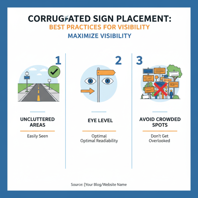
Best Practices for Placement and Visibility of Corrugated Signs
When creating corrugated signs, placement is crucial for maximizing visibility. Position your signs where they will be easily seen. This means avoiding crowded areas where they might get overlooked. Additionally, consider the height at which the sign is displayed. A sign too low may be missed, while one too high may be difficult to read. Aim for eye level where most people can easily see it.
The color of your sign matters too. Bright colors stand out against most backgrounds. However, overly bright colors can clash. Test combinations to find the right balance, ensuring text remains legible. It’s important to consider lighting as well. Signs placed in shadowy areas may go unnoticed. If possible, avoid locations that could be obstructed by trees or buildings.
Lastly, reflections can change how a sign is perceived. Signs facing windows might glare in the sun. Reflective surfaces can distract from your message. Evaluate your sign’s surroundings to avoid these pitfalls. Take time to assess placement before finalizing your design. Mistakes happen, but they provide valuable lessons for future projects.
Measuring Effectiveness: Metrics to Evaluate Sign Performance
Creating effective corrugated signs requires careful consideration of their performance metrics. Tracking these metrics helps determine if your sign does its job. Common indicators include visibility, engagement, and conversion rates. Visibility measures how well your sign attracts attention. Use bright colors and bold fonts to enhance visibility.
To evaluate engagement, ask yourself: Are people stopping to read the sign? Conduct informal surveys or gather feedback from passersby. This can reveal whether the message resonates. When crafting your sign, keep the message clear and concise. A cluttered design can lead to confusion.
Conversion rates show how many viewers take action after seeing the sign. Monitor any increase in foot traffic or sales linked to the sign's placement. If conversions are low, consider revising the design or location. Experimenting with different messages or graphics may improve results. Remember that creating effective signs is a process, often requiring adjustments based on feedback and data collected.